Design systems · · 6 min read
A mood board is how the fifth screen matches the first
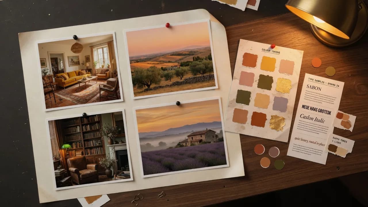
Generating a palette is easy. Generating a palette that stays readable at every pairing is the actual work. SketchMason reads a mood board for that work, then writes tokens bound to roles rather than a list of pretty swatches.
What the board is for
Up to six reference images per project. They steer palette, density and type personality. They are never copied into the design itself. Your sketch still decides the layout.
Roles, not colours
Surface, border, focus ring, destructive, muted text. A component asks for the role. Swap the values behind the roles and every screen follows. That indirection is what lets a flow survive a change of theme.
Contrast is a constraint
Body text needs a contrast ratio of at least 4.5 to 1 on the surface it sits on. Large text can go to 3 to 1. A generated guide that fails a pairing is a generated guide we can catch before anyone builds on it.
Where the taste goes
Warm rather than cool, dense rather than airy, serif rather than grotesque: that is still a designer's job. The constraints exist so the judgement is the only thing left to make. Drop the board in and generate the style guide first, then the screen.
Questions
- Where does the design system come from?
- A mood board. SketchMason reads the images for palette and typographic feel, then produces design tokens bound to roles, with contrast checked on the pairings that decide legibility.
- Are my reference images copied into the design?
- No. They steer palette, density and type. The sketch still decides the layout.
Keep reading
- How a labelled sketch becomes a UI
You do not prompt a layout into existence. You draw the boxes, write what they are, and the screen is generated from that.
- How to label a UI sketch so the model stops guessing
Write the component type, a piece of real copy, or a size constraint. Those three labels do more than a longer prompt.
- Uizard turns a sketch into a wireframe. SketchMason turns it into a design.
Both take a photo of a napkin. What comes back is the difference: an editable wireframe, or a finished screen built from your own design system.