Design systems · · 5 min read
A design system is just a set of constraints
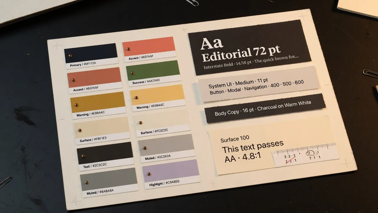
Ask a model for a colour palette and you will get one. It will be pleasant, it will photograph well, and roughly a third of the time some of its text will be illegible on its own background.
Contrast is a constraint, not a preference
Every foreground token has to be readable on the surface it sits on. Body text needs a contrast ratio of at least 4.5 to 1; large text can go to 3 to 1. These are not stylistic opinions, they are the difference between a design that ships and one that fails an audit.
So we ask for it explicitly, and we check it. A generated guide that fails a pairing is a generated guide we can catch before anyone builds on it.
Naming is half the system
A palette of eight nice colours is a mood board. A palette where each colour is bound to a role (surface, border, focus ring, destructive) is a system, because now a component can ask for the role rather than the colour.
That indirection is what lets one design survive a change of theme. Swap the values behind the roles and every screen follows.
Where the taste goes
None of this removes judgement. Deciding that a brand is warm rather than cool, dense rather than airy, serif rather than grotesque: that is the part worth a designer’s time. The constraints exist so that the judgement is the only thing left to make.
Keep reading
- How a labelled sketch becomes a UI
You do not prompt a layout into existence. You draw the boxes, write what they are, and the screen is generated from that.
- How to label a UI sketch so the model stops guessing
Write the component type, a piece of real copy, or a size constraint. Those three labels do more than a longer prompt.
- A mood board is how the fifth screen matches the first
A palette of eight nice colours is a mood. A palette where each colour is bound to a role is a system.